Executive Summary
-
For a great visitor management kiosk implementation, visibility is vital to ensuring guest usage, minimizing staff distractions, and enhancing workplace productivity.
-
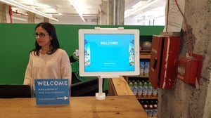
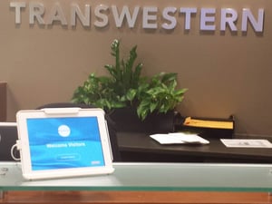
Some prime areas to place the visitor management hardware are front-and-center to the entrance, near or on the reception desk, or to the side of the lobby.
-
Other considerations include proximity to power outlets, areas with strong Wi-Fi, and spaces that will enhance visibility and user flow.
-
The kiosk’s placement should NOT interfere with free movement.
The goal of implementing a visitor management system is to create a great guest experience while focusing your team on productivity toward your primary mission. Therefore, where you physically place your check-in kiosk within your lobby or reception area is one of the most important tactics in success. Regardless of how attractive your virtual receptionist, is or how perfectly the check-in workflows work for you, if you place the kiosks out of site, you will struggle with user adoption.
What Is Visitor Management?
Why Is Kiosk Placement Vital for Visitor Management Success?
Where Should You Place Your Visitor Management Kiosk?
Other Kiosk Placement Considerations
What Is Visitor Management?
In its simplest terms, visitor management is how your organization handles visitors and guests who walk through your door. Whether you have a formalized plan or not, each and every workplace has a visitor management system in place.
Visitor management includes how you recognize guests, identify them, and connect them with the proper employee. More advanced approaches include collecting and storing visitor information, taking photos, capturing electronic signatures on legal documents, and even granting access to approved areas of your premises.
In order to keep employees productive, maximize security, and keep illnesses like COVID-19 out of their workplace, modern organizations have turned to cloud-based visitor management software.
Why Is Kiosk Placement Vital for Visitor Management Success?
In order for any visitor management plan to be effective, it must be very clear to visitors what they should do when they enter your reception area. For a digital visitor management system, this is especially important because it:
- Ensures visitors use the system.
- Minimizes staff distractions by helping visitors.
- Creates a great impression of an organized, modern workplace.
Even if your workplace has adopted touchless visitor management, kiosk placement is key. It serves as a strong visual cue about how to begin the sign-in and registration process.
Where Should You Place Your Visitor Management Kiosk?
Bank automated teller machines (ATMs) were some of the first mass-adopted kiosks by the consumer marketplace. Decades ago an ATM at a large bank branch might have been a backup option if the line to see a teller was long.
Many years and several generations of ATM kiosks later, they are front and center of the banking experience. Younger gen Z consumers say they only want digital financial industry experiences. This is why nearly every bank branch places one or more ATMs before you reach a human. It has also enabled the rise of branchless banking.
With thousands of licenses around the globe, we've identified options and best practices on what you should place your visitor management hardware:
- Front and Center
- Adjacent to Your Reception Desk
- On the Reception Desk
- On the Side of the Lobby
Front and Center
 One option is to place your check-in kiosk right in front of the visitor as they enter your lobby. Or, in some cases, in the foyer, before they even get through the front door.
This approach has one clear approach -- you ensure every visitor is exposed to your virtual receptionist immediately upon entering the facility. If you are designing a new workplace, we recommend you design a reception area where check-in hardware is front-and-center.
In a retrofit scenario, there may be downsides to this approach. These include mitigating the design aesthetic of your lobby and negative impacts on user flow. In a worst-case scenario, this could impact a safe emergency evacuation.
Next to Your Reception Desk
 The reception desk is the natural anchor of most lobby areas. Think about it. When you walk into an office for the first time, most likely your eyes will bounce around until you see the reception desk which you expect will guide you through how to register your visit.
This makes placing your visitor management hardware adjacent to the reception desk a smart approach. Depending on the layout of your lobby, you might want to put your check-in kiosk to the side closest to the door, or directly in front of the desk. You might even want to place the stand on the reception desk to ensure the visual strength of your placement.

On the Reception Desk
 All of the reasons above make placing your visitor management kiosk on the reception desk a great option. Depending, again, on your lobby layout and where the visitor's eyes go when they arrive will suggest whether on or near the reception desk is best.
An additional benefit of placing a visitor management solution on the desk is it minimizes floor space. This approach has the smallest impact on wayfinding and people traffic.
On the Side of the Lobby
In some cases, the best scenario may be to place your customer check-in system on the side of the reception area. This might be the case if your lobby has heavy foot traffic. If this is your placement decision, we recommended that you draw visibility to the kiosk. This can be achieved through signage and overhead LCD screens that promote the presence and availability of the kiosks.
Alcoves that the kiosks sit within that have overhead signage are not only attractive, but they also turn the kiosks into a destination. Stanchions and lines on the floor that create queues for the kiosks also signal that the kiosks are available and intended for the many, not the few. Again, the goal is to ensure that when a user enters the area, they look for the registration desk or box office and if the kiosks cannot be seen immediately before that desk, users will likely miss the kiosk altogether.
Other Kiosk Placement Considerations
User Flow and Visibility
 Self-service kiosks should be placed in a physical path or location that interrupts the guest flow. This kind of physical interruption is what is necessary to change the behavior from looking for a traditional-style receptionist, being confused, or distracting 'near-the-door' employees.
At the same time, it cannot literally block visitors or employees from moving about the premises. This is especially true in a high-traffic area or in an emergency situation.
Power Outlets
At first blush, the easiest placement is where you already have power. We suggest though that you take a step back and determine how a kiosk can serve your customer best at each considered location.
This may mean investing in routing power to the ideal kiosk placement. Usually spending a few hundred dollars with an electrician will maximize your visitor management software and hardware spend.
Strong Wifi
Similarly, your visitor management solution should not be placed over access to Internet or ethernet cables. Every modern check-in system is cloud-based. That said, you'll want to ensure consistent, strong Wifi. If necessary you can place a Wifi range extender.
Quantity of Kiosks
For nearly every Greetly client, one kiosk per visitor point of entry is enough. Unless there is a strong reason to suspect otherwise, we advise installing a single hardware unit and monitoring it before overspending.