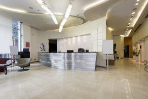
As anyone who's worked in customer and/or client service will tell you, first impressions are lasting impressions. As applied to your office, your reception area is your first impression. And the aesthetic and function of this space's furniture and layout can embody the vision and personality of your company, whether those values are innovation and resourcefulness or classic elegance. The look and feel of the reception area will leave an impression on every customer, client, guest, and especially your employees, who will have this impression reinforced multiple times per day.
Modern Reception Furnishings
- Much of the selection for modern office furnishings plays upon the creative use of geometry, this is no less true for reception furnishings. Reception desks, in particular, can be used to highlight this trend. One such example is the use of flowing lines exemplified by wraparound and curved desks.
- The use of glass to create a sense of open space is a common trend in modern offices. As with geometric trends, the use of glass is most commonly seen in the reception desk, as the desk is generally the largest and most visible element of a reception area.
- Mixing materials is a playful way to incorporate a sense of innovation into modern office design. This trend can be combined with both the use of interesting geometry and the use of glass as a building material. You could use the grain of natural wood as a compliment to glass or chrome pieces.
Modern Reception Design
 If your reception space doubles as a waiting room, it is important to ensure that furnishings are both comfortable, and conveniently located near power sources for technological devices. If a purely utilitarian space isn't in line with the vision of your company, chose art pieces that breathe life into the area and offset the aesthetic of the layout and materials used.
- Brand your reception space with the company's color scheme. If these colors are very bold or don't translate well to large spaces; re-purpose them as accents against a more neutral base tone. Accent colors can have impact along baseboards and wall trim, furnishings, or decorative pieces. Live plants and flowers line up well with multiple aesthetics while creating a soothing ambiance for visitors.
- Utilize the reception space to show staff and visitors that you care about them by including thoughtful extras in line with your brand.
- If your aesthetic is rustic or homey, providing a bowl of candy or freshly baked cookies will provide a warm welcome.
- If your vision is innovative and fast-paced, providing a well-stocked coffee bar can create that feeling of energy.
- A technologically advanced company can showcase its cutting edge nature with a visitor registration kiosk.
- Don't forget that music can be used to enhance any of the selections above.
Conclusion - Impress Guests With Modern Reception
Your lobby is your office's first impression. If set up correctly, it can convey what your brand and organization are about in a positive and meaningful manner. Or, you know, it can suggest your company is indifferent to its people and guests.
Modern design principles suggest furnishings with glass and flowing lines that make your space look open and clean. Colors, music, and amenities should be customized based on your brand and what your company does.